Introduction:
With the fast evolving digital world, mobile optimization of your website is no longer just a good idea, but mandatory. With the majority of web traffic coming from mobile devices, ensuring your website provides a seamless mobile experience can significantly impact user engagement, conversion rates, and search engine rankings. Here’s a comprehensive guide on how to optimize your website for mobile.

- Implement Responsive Design
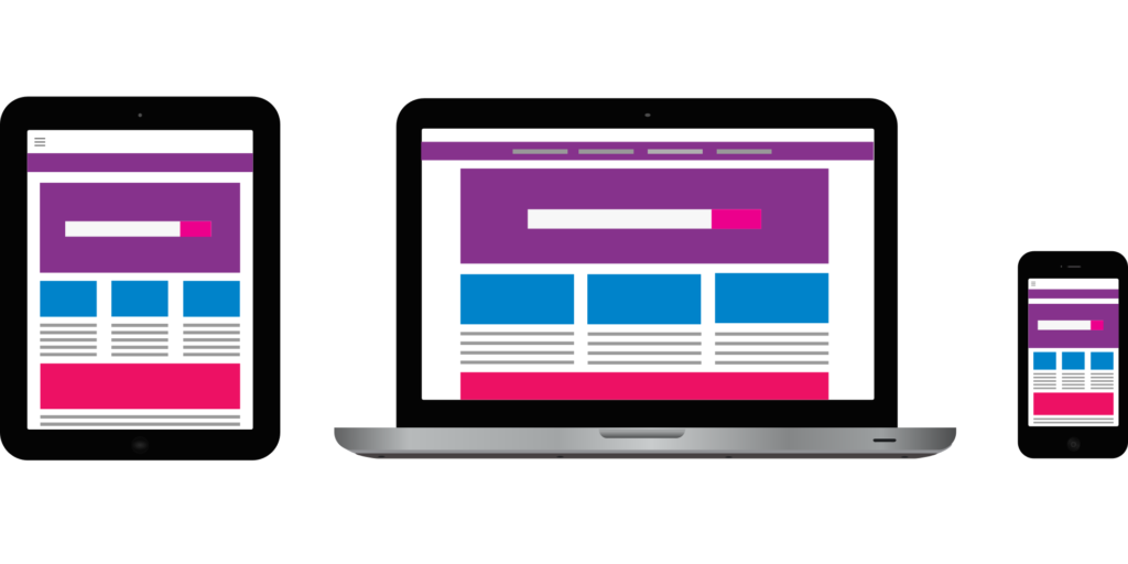
Responsive design guarantees that your webpage can be flexible to screen size and screen resolution variations. More precisely, this method can be applied to guarantee the same experience of use on all devices, i.e., smartphone, tablet and computer.
Wearable flexible grid displays that change autonomously their size depending on the displayed screen.
Implement image optimization with responsive image methods (i.e., srcset and CSS media queries).
Remove fixed width elements that do not scale correctly on small screens.
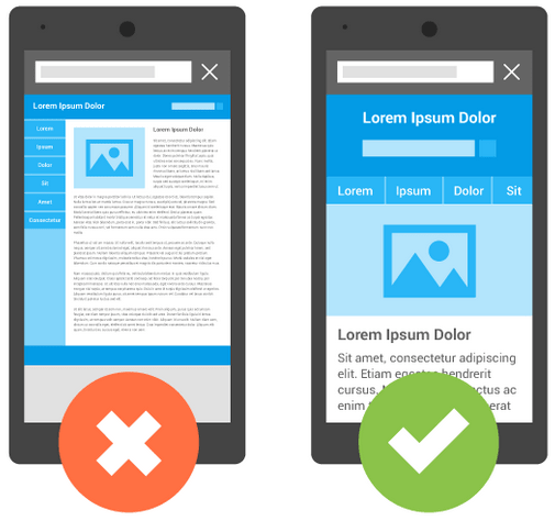
- Simplify Navigation
Mobile users need easy and intuitive navigation. Simplified navigation enhances user experience and reduces bounce rates.
Use a hamburger menu for a clean, minimalist look.
Place important data in thumb’s reach, which is around the lower third of the screen.
Menu items should be kept to the simplest ones in order to prevent users from becoming overwhelmed.
- Optimize Page Load Speed
Slow-loading pages can frustrate users and increase bounce rates. Here’s how to speed up your mobile site:
Compress images/files using tools like ImageOptim or TinyPNG.
Enable browser caching to store frequently accessed resources.
Minify CSS, JavaScript, and HTML to reduce file size.
- Improve Readability
Mobile displays are the small screen, text shall be easily readable, without the need of zooming or scrolling.
Use larger font sizes, ideally 16px or more.
Keep to basic, legible fonts, which can be comfortably read on the small screen.
Ensure sufficient contrast between text and background for readability.
- Optimize Forms for Mobile
Forms play a vital role for lead generation, yet they can be a pain point on the mobile device if not designed well.
Use input types that automatically supply the right keyboard (e.g., phone fields number keypad).
Simplify forms by reducing the number of fields.
Use auto-fill and validation to streamline form completion.
- Test on Multiple Devices
Testing confirms the proper operation of the site on different devices and screen resolutions.
Use tools like Google’s Mobile-Friendly Test to analyze performance.
Otherwise, please take a look at the site manually on different devices to check if there are any problems.
Obtaining user feedback to discover areas of potential enhancement.
- Leverage Accelerated Mobile Pages (AMP)
AMP is a community-driven, open-source effort to enhance mobile web performance. “It enables web pages to load almost instantly on mobile devices.
AMP is recommended to be used to speed things up for a small number of key pages.
When you work with wordpress platforms, use AMP-enabled plugins.
- Prioritize Mobile SEO
Mobile optimization of a website for mobile search engine optimisation is a cornerstone of a good search engine ranking.
Mobile-first index (MOI) which Google will largely rely on the website’s presentation on its mobile version for deciding the ranking of the site.
Read this: Evolution of Google’s Algorithms in 2025
Optimize meta tags for mobile to improve click-through rates.
It is important optimized local SEO, which can attract local information search by mobile users.
Conclusion:
Mobile-optimizing your website plays a crucial role in the ongoing effort to deliver a positive user experience, improve search engine result page performance, and drive sales. Through using responsive design, streamlining navigation, increasing speed of the site, and tailoring for mobile SEO, the site will not only meet user expectations, but will also fare well in the crowded web environment.
Ready to transform your website into a mobile-friendly powerhouse? Just get rolling with these tips today and your mobile traffic will be sure to blow up!